8 Design Tips to Create the Perfect Banner
MARCH 21, 2019| SpeedProCategories
SignageNo matter what your statement is, a large banner with a bold design, complete with striking colors and simplistic text, is a great way of making it. Of course, banners and other types of signage and advertisements are everywhere. There’s quite a bit vying for our attention as we walk down the street and through buildings, so how can you ensure your banner gets noticed?
The perfect banner doesn’t happen by accident. It takes some strategic design decisions. Let’s check out eight vinyl banner design tips to help you create the perfect banner.
1. Know Your Purpose
To design the perfect banner, you need to start by making sure you have a clear understanding of your purpose. Why are you creating one in the first place? What is it meant to achieve? Here are a few possible goals to consider:
- Increase brand awareness
- Rebrand or change the public’s perception of your brand
- Highlight a new product
- Call attention to a sale or promotion
- Promote an upcoming event
- Create a sense of community in a place
- Raise awareness for a social cause
There are countless potential purposes for banners — these are just a few examples. Note that some purposes are more ongoing and may involve banners being hung for a long time, while others are temporary in nature.
It may seem overly obvious to consider your purpose, but this is a crucial first step. Once you know exactly what your banner is meant to achieve, you can let that goal — or those goals — directly inform the way you design it. As we’ll talk about later, you want to keep your banner simplistic in its design, so it’s critical for every bit of the design to help you achieve your purpose.
2. Make the Banner Pop From Its Surroundings
After you have a firm idea of your banner’s purpose, you want to think through exactly where it’ll be placed. For starters, will it be inside or outside? At your place of business or event location, or hung elsewhere? While placement is important for a number of reasons, the key here is the banner’s physical surroundings. You want your banner to pop in order to get the attention of passersby, so you must consider what backdrop it will be competing with to stand out.
If you don’t pay close attention to surroundings, you could, for instance, design a banner with what appears to be an eye-catching red and orange color scheme and then find out that it’s hung on the face of a red brick building, where it gets lost in the similar surrounding colors. In this case, a color like white, blue or green would be a much better choice than red or orange.
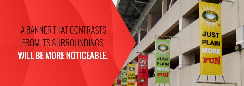
In some cases, you may need to include a white or black border around the sides of your banner’s design to help it pop, especially if it’s going to be competing with a busy backdrop. A banner that contrasts from its surroundings will be more noticeable. In addition, according to what’s known as the isolation effect, this kind of placement will also increase the likelihood that people remember the banner, even after it’s no longer in sight.
3. Choose Colors Wisely
Choosing a color scheme that helps your banner pop isn’t the only thing to think about. Anyone who works in marketing or graphic design knows that color is also critical in conveying the right message. One study found that people form an opinion of people and products within 90 seconds, and anywhere from 62 to 90 percent of that opinion is based solely on colors.
While color associations and preferences are a personal matter that varies from person to person, there are also broader cultural associations attached to various colors that tend to affect people’s perceptions in general. For example, in the U.S., green is often associated with the environment and with money.
If color is so important, what are the best colors for vinyl banners? The answer depends on what sort of impression you want to give. In many cases, the important work of choosing appropriate colors for your banner has already taken place with your branding. If you’re designing a banner that’s meant to get your name out there and create better brand recognition, it’s crucial for the design to prominently feature your brand’s colors.
Not only do you want your banner to feature your brand’s colors, but you also want to make sure it does so accurately. In other words, you don’t want a different tone or shade of blue than the exact blue you’ve chosen to represent your brand. To achieve perfect accuracy, make sure you hire a print company with expertise in color matching.
4. Use High-Quality Images
Whether they’re photographs or graphic art, eye-catching images offer an excellent way of enhancing your banner’s design. However, one of the most common wide-format printing mistakes is to use low-quality images that look blurry or grainy on the finished product. When you’re looking at a picture on your computer screen, it can be difficult to tell what that item will actually look like when it’s blown up to fit a banner that’s several feet across.
For your image to look clear and sharp even when it’s enlarged, you need to use the right type of file with a high enough resolution. In general, images saved from the internet won’t fit the bill. There are two main file types to be aware of:
- Vector (outlines): Vector images are line art graphics that will maintain their quality no matter how you resize them.
- Raster (bitmaps): Raster, or bitmap, images are comprised of tiny dots that form a picture. These images can only stand to be enlarged a certain amount before losing clarity.

If you’re creating a graphic for your banner, be sure to save it as a Vector file. Doing so ensures that the image won’t lose clarity when it’s enlarged. If you’re using a photograph or any type of raster image — including .jpg, .tif and other common file types — make sure the file isn’t compressed, and save it with an output resolution between 100 and 200 dots per inch (DPI) at the full image size. This strategy will help you achieve the best clarity.
You should also make sure you use a printer that will print your banner using a high resolution. For example, at Speedpro, we often print images at 720 DPI, which results in an impressively sharp image.
5. Make Text Readable From a Distance
The good news regarding image quality is that the further away a person is from the banner, the sharper the images on it will appear. However, the distance can potentially have a negative impact when it comes to readability. The key is knowing what distance your banner will be viewed from and then making sure any text on the banner is easily readable from that distance. This design tip is an especially important one for someone creating an outdoor banner.
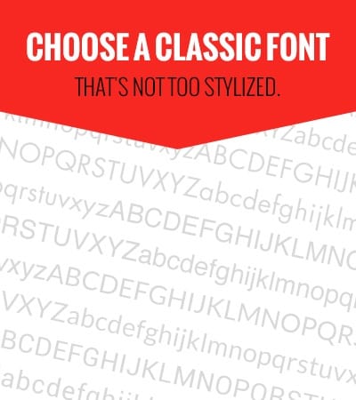
Have you ever created a slide presentation that appeared to be perfectly readable on your computer screen, but once projected on the wall a distance from the audience, clearly needed a larger font size? This same scenario can play out with a banner if you’re not careful. It isn’t just size that can be an issue either. Some fonts, especially script fonts, can be difficult to make out, especially from a distance.
So how can you make sure passersby have no trouble reading the message on your banner? First, choose a classic font that’s not too stylized. You may even want to bold the font if the letters look a bit thin.
Second, follow the 10 to 100 rule of thumb. This rule dictates that your letter height should be 10 inches to be readable at a distance of 100 feet. We can turn this rule into a simple formula that would look like this: Distance in feet/10 = letter height in inches. See our Letter Visibility Chart under the Signs category on our FAQ for more details on how large your text needs to be in order to be seen from various distances.
6. Keep Text Concise
If you’re having trouble making your text large enough without running out of room on the banner, the answer isn’t necessarily a larger banner size, though that may help increase the impact of your banner. No matter how big your banner is, you want to keep your text concise. It’s not the time to wax poetic. Instead, you want to focus on getting your message across as directly as possible.
Especially if your banner is going to be placed in a location with foot traffic, you can’t expect people to stop to read your banner for as long as it takes. They’ll most likely only glance at it for a few seconds. How can you package your message so that it fits within this short attention span? One way is to take advantage of the non-textual elements you include. Make sure the graphics on the banner help to convey the message just like the text does.
For the text, stick to the three by five rule. No, it doesn’t mean your text needs to fit onto an index card, thankfully. The three by five rule is a helpful guide for banner design. This guide says to keep text to a maximum of 15 words, which can appear roughly as three words times five lines or as five words times three lines.
7. Make Sure Large Banners Have a Clear Focal Point
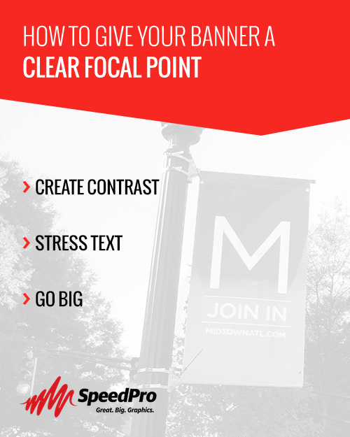
Especially for large banners, part of your strategic design must be designating a clear focal point. The hope, of course, is that people will see and read the entirety of your banner, but if they’re just giving it a passing glance, you want to tell their eyes where to look so that they gather the essential information.
Your focal point can be an image, a logo, a word or a line of text. You can put the spotlight on a certain portion of your banner in a number of ways. Here are a few methods to try:
- Create contrast: You can use a bold color on a particular image or word to make it stand out from the rest of the banner. Surrounding the colorful text or image with a bit of white space can also help to make it pop.
- Stress text: For text, you can underline, highlight, bolden or capitalize the text to draw a person’s eyes immediately to a particular word or line. Nearly all people recognize instantly that the underlined or otherwise altered text is the most important for them to read.
- Go big: You can also simply make the emphasized portion, whether it be text or image, appear larger than other elements on the banner. Larger images will immediately attract more attention than smaller details.
As you’re determining where your banner’s focal point is, don’t worry over the idea that it’ll be the only part of your banner people pay attention to. Your focal point is like the hook. Remember, you have to get people’s attention first before they’ll be interested enough to look at the rest of the banner.
8. Use Quality Materials
So what if you follow the last seven tips and design a banner that’s eye-catching and informative, but it gets printed on low-quality materials or with low print resolution? That’s not a situation you want to experience. As you get caught up in designing your banner, don’t forget that the physical materials themselves are also extremely important if you want your finished product to look professional.
One thing to consider when you’re choosing materials is your banner’s setting. If your banner is going to be placed inside, this factor isn’t much of a concern. However, if it’s going to be hung outside where wind may be an issue, consider using a mesh banner that allows airflow to pass through.
An experienced printer should be able to steer you toward the best materials for your application. Make sure your printer uses high-quality materials from leading manufacturers so that they can present you with a finished product that lives up to your expectations and catches the eyes of passersby with its vibrant colors.
Trust SpeedPro to Print Your Banner
When you’ve spent precious resources on coming up with the perfect banner design, you want to make sure you entrust that design to a printer who can turn your dream into a reality. At Speedpro, we have the expertise to help guide you through the printing process, and we’ll produce a finished product you’re proud to display.
We print our banners with fade-resistant, full-color inks, so you can be sure your banner will look just as vibrant much later as it did the day you received it. We’re equipped to print a wide range of banners that vary in size and color, so you won’t have to limit yourself when you work with us. If you want to make an impact, we can help you do it in style. Get started today by finding a studio near you.