What is Color Matching in Large Format Printing?
JUNE 13, 2022| kaylarWhat Is Color Matching?
Here at SpeedPro Greenville, we consider color matching to be one of the most important services we can offer for your project – although it’s one of the toughest tasks. Your brand is the focal point of your custom graphics, so we want to make sure our graphics correctly represent your brand. We’re here to bring your vision to life, complete with all the colors and vibrancy you envision.
One important aspect of color: every person perceives variations of color differently. Both biological and environmental factors affect how we percieve color. For instance, the colors we see when we’re young are actually slightly different than the ones we perceive when we’re older. Another example is color blindness.
Colors may also change during a game of visual “telephone” as images move from one screen to another and various edits are made. The original and the final products may be off by an entire shade if your design chain consists of too many links. Colors also look different based on hardware and screens with differing brightness and contrast settings.
When the time finally comes to take your project to a printer, the technology and materials—like inks and media—add more variables to how your image might turn out. Protective laminates, ink types and even a medium’s texture slightly effects how colors appear on a finished product.
The vast array of variables at play can be almost frightening. There’s no need for fear, however, as our experts at SpeedPro are here to ensure the proper colors translate correctly on your completed project. Feel free to request printed samples if you’re trying to achieve a specific color.
Tips For Color Matching From The Client Side
Before we get an image from you to print, there are some steps you can take as part of your design process to help you capture the most exact colors possible:
- Make sure that glare and poor lighting conditions are not affecting your ability to see what’s on your monitor.
- Get a good, high quality LED display with strong reviews and turn all color profiles off before you start designing.
- Realize a monitor calibration is only for your own design phase and won’t match exactly when you print.
- Know that while you can design in RGB, we will most likely be convert the file to CMYK for print. Printing CMYK produces better color quality, but if the color changes when we conver, we’ll send you a new proof for approval.
- Document your colors using the Pantone color library. Designers and printers worldwide use these color swatches as the standard.
- Make use of soft-proofing options in design tools like Photoshop to simulate a proof prior to sending your project to a printer for a hard proof.
There are two major factors that will help us in our color matching process: color profiles and Pantones. With these, we’re better able to produce the color you’re looking for.
Color Profiles
Most digital artists set up their artwork in one of the two primary color profiles: RGB (Red/Green/Blue), or CMYK (Cyan/Magenta/Yellow/Black). However, we can’t perfectly reproduce every single color that we see in reality with either system. Therefore, colors will vary subtly as images move from the monitor to printed material.
The RGB profile is based on the optical colors of light and is the color definition as given by digital devices. In other words, the RGB profile includes colors produced by cameras and monitors. CMYK, on the other hand, is the color profile for pigments – the colors reflected by materials in real life.
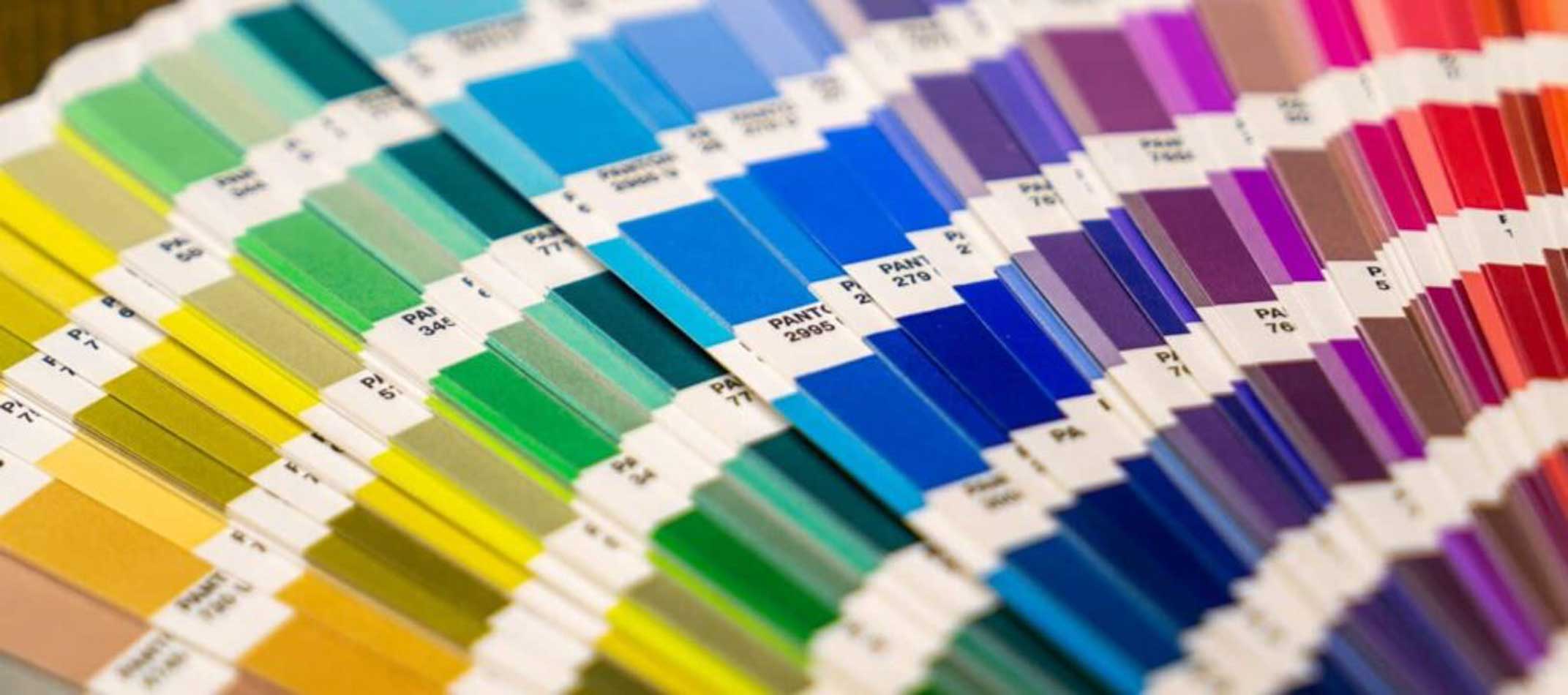
Pantones
Sometimes called PMS colors, the Pantone Matching System (PMS) consists of over 2000 uniquely-identified colors. This color book is a standard accepted worldwide, therefore allowing printers to match precise colors and keep an image consistent while printing. (Learn even more about Pantones here.)
Due to the complexities of digital-to-physical color mapping, we can’t guarantee that we can exactly match all spot colors. However, provide Pantone colors to get the closest match to your ideal hue. We’ll create a digital proof for you to approve before we send your graphic to the printer, and we can create a physical sample as well if needed.
Colors We Can’t Match
There are a few colors we are not able to match perfectly:
- Vehicle Paint – We are unable to exactly mimick a vehicle’s paint job. Even white vehicles are sometimes painted with a slightly different white than our vinyl. Or, if your vehicle’s paint has started to fade from the sun, our vinyl can’t match weathered paint.
- Fabric Colors – Even if you provide a PMS color, our PMS Cool Grey won’t match your t-shirt’s PMS Cool Grey because our materials are different. Different materials accept inks differently, resulting in slightly different colors.
- Specialty Colors – Some colors, like neon pink, can’t be duplicated using our printers. Some pre-colored vinyls are available, but there most likely won’t be the exact color you’re looking for. We can probably get close though!
Conclusion
Regardless of the color you’re trying to match, we’ll do our best to produce the color you’re aiming for. Feel free to request samples or come to our shop to look at our color wheels.