Color matching

What is Color Matching?
Here at SpeedPro, we consider color matching to be one of the most important jobs we can do for you. It’s also one of the toughest tasks: We’re here to help you take your chosen design from the screen to an accurate representation printed out in the real world and getting the colors you envisioned in the first place to look the way you want them to is key.
Before we even get an image from you to print, there are some steps you can take as part of your design process that can help you capture the most exact colors possible:
- Make sure that glare and poor lighting conditions are not affecting your ability to see what’s on your monitor.
- Get a good, high quality LED display with strong reviews and turn all color profiles off before you start designing.
- Realize that a monitor calibration is only for your own design phase and won’t match exactly when you print. SpeedPro uses an I1 device to calibrate to a PMS color build and will work with you to get the colors you want to see in your printed design. You can use the PMS color book to compare CMYK against your own designs.
- Design your project from the start using the RGB color profile. While printers use CMYK, you should work in RGB because the color gamut is broader. Printers scale that down when they print..
- Document your colors using the Pantone color library. These color swatches are standards used by designers and printers worldwide.
- Make use of soft-proofing options in design tools like Photoshop to simulate a proof prior to sending your project to a printer for a hard proof.
It is important to realize that every person perceives variations of color differently, due to both biological and environmental factors that can change over any amount of time. The colors we see when we’re young, for instance, are not exactly the same as the ones we perceive when we’re older.
Colors can also change in a game of visual “telephone” as images move from one device and monitor to another and land in front of different artists and designers along the way. The original and the final products may be off by an entire shade if too many links are in your design chain. Colors will look different based on not only the hardware but also the many various settings such as brightness and contrast.
When the time finally comes to take your project to a printer, the type of technology and materials they have available—like inks and media—add more variables to how your image might turn out. Laminates on a medium, the ink types and even something seemingly harmless like a medium’s texture will have some perceivable effects on how colors end up appearing on a finished product.
The vast array of variables at play can be almost frightening. There’s no need for that, however, as our experts at SpeedPro are here to ensure you get the proper colors translated over to your completed project.
There are two major factors that will help us in our color matching process: Color profiles and Pantones.
Color Profiles
Design and art files created digitally usually are set up with one of two primary color profiles: RGB, which stands for Red/Green/Blue, or CMYK, which stands for Cyan/Magenta/Yellow/Black. Despite this, not every single color that we can see in reality can be perfectly reproduced with either system and colors will, therefore, vary subtly as images move from monitor to printed material.
The RGB profile is based on the optical colors of light and is the color definition that is utilized by digital devices like cameras and monitors that ultimately gives us the images we see through those devices.
CMYK, on the other hand, is the color profile for pigments–the colors reflected by materials in real life. These are the four colors used in “4-color printing” that many fans of graphic design will easily recognize from the colorful pages of comic books from the 1930’s on.
Mixing RGB light creates white light while mixing CMYK pigments creates black. Because of this, a designer is able to make colors on a screen using the RGB profile that can be difficult to reproduce accurately by a CMYK printing process. Despite that, it is better to design in RGB because you can create the best possible version of your design. This is why it’s best to design from the start using the CMYK color profile. However, if you bring us an RGB file, our engineers will take your digital files through printer-specific programs to convert them into CMYK.
Pantones
Sometimes called PMS, the Pantone Matching System (PMS) consists of about 200 uniquely-identified colors. This is a standard accepted worldwide, therefore allowing printers all over to match precise colors and keep an image consistent throughout all steps of a printing process. (Learn even more about Pantones here.) Due to the complexities of digital-to-physical color mapping, we can’t guarantee that we can hit all spot colors. However, if you can provide Pantone reference numbers that will be helpful as we proceed with color matching and hard proof creation for you to approve. This smaller version of your project will show you the actual colors on the final materials and inks.Powerful Color-Creating Printer Technology
SpeedPro’s digital printers provide exceptional quality. We can print up to 1440 dpi with inks that can last up to 4 years outdoors, even without lamination. Our waterproof, solvent-based, UV-resisting inks even resist fading.SpeedPro Charlotte Center
If you do business in the Charlotte area, you know how much fun the city can be — from cultural and sporting events to all the exhilarating outdoor activities. Visitors flock to Charlotte to enjoy these things and more. When you run a company here, you want to connect with other residents to help your business grow. That can be challenging because of the steep competition. You have to break through the clutter of advertising to get people’s attention.
A Sign Company and Much, Much More
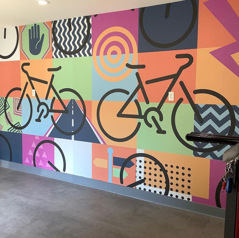
What types of great, big graphics can we create for your company? Ask us to do a big or small project, and we’ll dive right in. We don’t say “no” to anything. Want an elevator wrap to celebrate your company’s anniversary? A colorful banner to hang in your restaurant’s lobby? Or a point-of-purchase display to hand out free samples in your retail store? We can make it all happen.
Pick SpeedPro Charlotte Center for Large-Format Printing
We establish longstanding relationships with our clients, who return to us again and again. Some of the benefits of working with SpeedPro Charlotte Center include:
- Precision: We rely on digital measurements to size your graphics correctly.
- Innovation: Our projects employ state-of-the-art technology for greater effectiveness and efficiency.
- Timely communication: We provide regular updates and answer your questions.
- Professionalism: We treat every client with the respect they deserve.
Get a Quote From SpeedPro Charlotte Center
If you want your business in the greater Charlotte region to stand out, you need to invest in high-quality graphics to attract interest. Trust us to deliver the large-format printing you need. You’ll love the way we can get your message noticed.
We have solutions for a range of industries including banking and finance, hospitality and healthcare. Contact us today to set up a consultation or get a quote from SpeedPro Charlotte Center.