HOW ENVIRONMENTS AFFECT MOODS
JUNE 15, 2019| SpeedPro Chicago LoopCategories
PrintingNo matter where we are, we’re deeply shaped by our environments. Whether it’s an office or a living room, different settings produce different responses. A wide range of environmental factors affect the way we react to a space, from noisy air conditioners to the color of the walls.
Everyone has their own tastes and preferences, so everyone will respond to a setting in their own way. However, researchers have noticed definite trends across countries and cultures — some environments consistently produce certain mental and emotional effects.
Before you decide to re-paint your dining room walls or install new company signage, make sure you understand what makes environments stressful and what makes them stress-free. Our environments have the power to make us experience a wide variety of emotions — some feel overwhelming or depressing while others cultivate energy and inspiration.
Environments have a direct effect on our moods, although these reactions aren’t always predictable. Everyone will respond differently to different environments — no two people have the same preferences. These predetermined preferences include factors such as:
Cultural background
Occupation and professional circumstances
Artistic and cultural influences
Social status
Personality
Education
Personal circumstances and experiences
Our cultural, emotional and social backgrounds influence the way we react to different environments, and much of our taste is determined by our experiences. However, some trends prevail across time and place — certain environments tend to evoke certain responses despite a person’s background. In particular, environments affect us in the ways we interact, our behavior and our emotions. They:
Affect social interactions: Environments can either facilitate or discourage social interactions. Spaces designed to encourage conversation and community are often seen as inviting, cheerful and secure. Settings that are closed off or lack seating can stifle social interactions.
Influence behavior and motivation: Different environments affect our behavior and motivation to act. For example, a crowded and cluttered storage room will invite employees to return items haphazardly and carelessly. In contrast, a clean room with adequate storage encourages employees to take the time to put things away.
Shape moods and emotions: Most obviously, our environments influence our moods. Different settings evoke different emotional responses. For example, recent research indicates that rooms with bright light, either artificial or natural, can lessen the effects of depression and agitation.
Let’s focus on how settings affect our emotional responses. First, let’s examine common environmental stressors that can change our moods.
COMMON STRESSORS IN ENVIRONMENTS
Endless elements contribute to our response to environments, and they’re different for every person. However, certain factors tend to create more stress than others across the board. Typically, stressors are environmental factors that you can’t control, including the following:
Low ceilings: Low ceilings can make people feel closed-in and confined. This claustrophobic effect stifles innovation and creativity, and it can lead to anti-social behaviors and stress.
Loud noises: Loud noises can create a stressful environment whether they’re constant, like an old air conditioning unit, or temporary, like nearby construction.
Glare: Glare from overly bright lights often produces a stressful environment. This effect is compounded when glare reflects off of glass and screens — digital glare is a leading cause of eye strain and the onset of computer vision syndrome, which only increases the long-term stress of employees.
Poor air quality: Poor air quality is another common environmental stressor — whether it’s caused by cigarette smoke or smog, bad air can lead to stress and other health problems.
Uncomfortable temperatures: Uncomfortable temperatures are known stressors in any environment. Extreme heat can lead to lethargy and heart strain, while exposure to cold can damage circulation.
Unpleasant scents: Whether it’s your coworker’s too-strong cologne or old, dingy carpeting, bad smells are another common stressor.
The world is filled with stressful spaces. However, it’s possible to reduce these factors — below are three ways to make sure your environment is as stress-free as possible.
Social design: For a less-stressful environment, consider implementing designs that encourage social interaction. Open cubicles and community rooms make an office feel more connected, collaborative and productive, while closed-off spaces tend to generate anxiety and stress.
Integration of nature: Exposure to nature makes us healthier. Whether through windows or interior plants and gardens, try bringing a bit of the outside into your rooms and offices — plants will increase the air quality of your space and also help keep you and your staff healthy, happy and relaxed.
Relaxing aromas: Pleasant scents create enjoyable settings. Whether you prefer the ambiance of candles or the efficiency of air fresheners, consider implementing aromas in your environment. Different scents can produce different effects — for example, while lavender is associated with stress relief, rosemary can encourage accuracy and rejuvenation.
But eliminating stressors isn’t always enough to eliminate stress in an environment. Even well-lit rooms with vaulted ceilings can be depressing if they contain the wrong colors.
COLOR AND ENVIRONMENTS
Color is one of the most significant influences on people in an environment.
Color psychology, or the study of how colors affect moods and thoughts, has shown that different colors evoke different moods. The colors of a particular setting generate various mental and emotional responses. Warm colors, for example, tend to create feelings of energy, strength and joy, while cool colors are associated with calm and creativity.
EFFECTS OF WARM COLORS
Warm colors evoke the sun and fire, and they appear nearer to the eye than cooler colors. This quality makes them bold, forceful colors, conveying action, vitality and power. Marketers often choose warm colors for advertisements to generate a sense of urgency as well as optimism.
However, every person responds differently to every color. While many people link yellow with happiness, for example, you may find the color repellant. With that in mind, here are five warm colors and their common associations:
Red: The color red boosts skills revolving around accuracy and attention to detail. Intense and strong, red often creates feelings of excitement, and it’s associated with comfort, warmth and love. Red is a powerful color — while it can overpower and intimidate in large amounts, it can promote activity when used strategically.
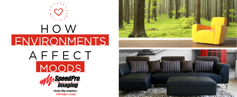
Yellow: High-energy and exciting, yellow tends to grab the eye when you enter a new environment. When it’s used in accents, yellow can make people feel happy, cheerful and positive. However, it can also come across as overly intense and even aggressive. Yellow is often associated with food and appetite, making it a favorite choice for restaurant branding, menus and advertising.
Orange: Orange combines the effects of red and yellow. Conveying feelings of enthusiasm, excitement and warmth, it’s often used to draw attention, such as in traffic signs. Because it’s less overwhelming than yellow or red, many people have a greater tolerance for orange than the more intense warm colors.
Pink: Associated with kindness, love and femininity, pink is a calming color that can reduce stress. For example, it has been used to temporarily calm prison inmates. However, this effect tends to decrease over time — the more accustomed people get to a pink environment, the less effective it is. As a result, the color is generally considered best in small doses, such as in accents like pillows, rugs and signage.
Brown: Brown can be either a warm or cool color depending on its tone. Rugged and natural, brown is a stable and reliable color often associated with warmth, security and friendship. Since the color is connected to the earth, people frequently associate brown with fall and winter, and the hue is known to stimulate the appetite.
Warm colors advance toward the eye, making them pop in any setting. As a whole, they convey power and activity — they go well in gyms, living areas and high-traffic rooms.
EFFECTS OF COOL COLORS
It’s no coincidence that blue is the world’s favorite color — we associate cool tones with many positive things, including water and the sky. Cool colors often make us feel refreshed, much like the natural areas they’re associated with.
Below are three of the most loved cool colors, along with their common connotations:
Blue: Blue-painted walls encourage creativity and peace. Because it tends to lower blood pressure and decrease respiration, blue is especially effective in rooms with high traffic. It’s connected to loyalty, truth and wisdom, and it can increase focus when it’s used in decor.
Purple: Associated with creativity and sophistication, purple blends red and blue to provide a balance between energy and serenity. Purple is the classic shade of royalty, so many people connect it with prosperity, wealth and respect. However, purples can carry negative connotations when overdone — if they’re used too much or in the wrong context, it can show tackiness and insincerity.
Green: Green is connected to rest and vitality. There’s a scientific reason behind its relaxing effect — green is the easiest color for the eye to see, reducing strain on your eye muscles. The color encourages concentration, making it perfect for office settings. For many people, green carries connotations of health, nature and harmony, although its setting will affect its perception.
In general, cool colors tend to create calming environments. For this reason, cool tones are common in large doses, while many warm hues are used as accent colors. Cool colors recede from the eye, making an environment seem more spacious and open. This characteristic makes them ideal for small environments.
EFFECTS OF NEUTRAL COLORS
Neutrals are the versatile hues you can’t describe with a definite color name. If you can’t call a color a form of yellow, blue, green, red, orange or purple, it’s most likely a neutral. These colors are prominent in almost every environment. Below are four popular neutrals and their typical associations.
White: Associated with innocence, cleanliness and youthfulness, white is one of the world’s favorite neutrals. It’s often associated with order and efficiency — when used in well-lit environments, it can create a soothing, inspiring atmosphere. However, white can also seem stark and clinical if it’s used too much. To keep it from appearing cold and sterile, pair it with other colors to lessen any starkness.
Black: Black is often associated with strength, power and authority. It also conveys a sense of intelligence and elegance. For some people, black is connected to slimness and thinness, which makes it a perfect color for fitness contexts. Powerful, sleek and mysterious, black has a grounding effect on an environment when it’s used strategically.
Gray: Gray is timeless, practical and impartial. A cool neutral, the color is connected with formality and sophistication in many settings. However, the conservative color can also convey a sense of dinginess, dullness and loneliness if it’s used too heavily. Unemotional and detached, gray is a perfect neutral to pair with an otherwise color-saturated environment — it doesn’t bring extra feelings into a setting. It can also connote wisdom and responsibility, as it’s often seen as the color of old age.
Beige: Although beige is technically considered a warm color, it’s used most often in neutral contexts. Beige is an incredibly popular neutral in interior design, particularly as a wall color. Conveying calmness and relaxation, it’s a safe choice for many environments. However, beige can suggest sameness and conventional thinking — if you want to show innovation, creativity or action in your environments, try a different color.
When neutrals dominate an environment, these colors can create a conservative, understated tone — the setting will feel neutral. However, a neutral-heavy environment can stifle creativity and energy, so these options work best when they’re paired with other colors.
HOW TO USE SIGNAGE TO INFLUENCE ENVIRONMENTS
Environments have a lot of influence — depending on their design, they can make people feel stressed or at ease. For marketers, incorporating creative signage is the perfect way to enhance a setting. Utilizing color and placement, you can make your signs work in any environment.
1. USE COLOR
When you’re designing signage, take full advantage of color theory. Do you want to convey a sense of urgency and action? Use red in a sign or banner announcing a sale or promotion. Are you hoping to connect your brand with serenity and professionalism? Try signage featuring cool blues and greens.
Think about the emotions you want your company, product or services to evoke. For example, if you want customers to associate you with energy and excitement, use orange in your branding. Also, consider the emotions or moods that are important to your customer base — if you’re marketing to upper-income consumers, use elegant colors like black and gold to connect sophistication to your brand.
2. PLACE COLORS STRATEGICALLY
Well-placed signage makes environments easy to navigate, reducing stress and making a setting more enjoyable. Signage helps guide people through a space, whether it’s a subway station or a department store. Clear signs marking different areas of a store give customers direction, making their shopping more efficient and less stressful.
In an office setting, use signage to clearly label the names and functions of different rooms. Doing so will help guests in the office navigate the space and give the environment more definition for your employees.
Good signage helps people feel in control of their surroundings — it’s much easier to navigate a clearly marked environment. However, too many promotional or marketing-based signs can create confusion and visual clutter, generating a negative setting. Only use as much signage as necessary for clarity — anything else will create a busy and stressful environment.
MAKE THE MOST OF YOUR SPACE
Environments are powerful. Depending on situational stressors and color choices, a setting can make someone feel depressed or stimulated. One of our specialties at SpeedPro Chicago Loop is Environmental Graphics: acoustic felt panels, acrylic elements, decorative wall coverings and window graphics that can change the atmosphere of an entire room.
Signage is another effective way to make your setting a positive, uplifting space — but to create an attractive, stylish environment, you need attractive, stylish signs. SpeedPro Chicago Loop is always ready to partner with you on your next signage campaign.
When you work with SpeedPro Chicago Loop, you can rest assured knowing that you’re getting the best possible service and superior products.
Make the most of your space — contact us with your ideas today and let’s start the conversation.