
TIPS FOR DESIGNING EFFECTIVE CAMPAIGN SIGNAGE IN FLORIDA
SEPTEMBER 25, 2020| SpeedPro Tampa EastCategories
Uncategorized
Signs are a common part of our environment. We see them everywhere we go, and during campaign seasons, that is truer than ever. But do all those campaign signs really make a difference? The simple answer is yes — campaign signs can even swing a close election. But these political signs and banners need to be well-designed to maximize their effectiveness. If you’re creating political campaign signage, follow these tips to engage your audience and enhance your campaign.
1. CHOOSE A VARIETY OF SIGNAGE TYPES
You can order many types of political signs at wholesale to fill yards, public spaces and your campaign office. A well-rounded campaign should involve multiple signage types so you can attract attention and share various messages across many locations. Some options to consider include the following:
- Banners
- Yard signs
- Flags
- Vehicle wraps
- Decals and magnets
- Digital signage
You may also want to create displays for events, such as custom event tents and tabletop displays. The more displays you can customize with your campaign branding, the better.
2. KNOW YOUR AUDIENCE AND YOUR GOAL
First, it’s important to understand your audience and your goal for every sign you design. You may want to create separate displays to achieve different goals or appeal to different audiences. In terms of audience, you want to know whether a sign is primarily meant to appeal to voters within your party, voters from another party or undecided voters, or whether it needs to communicate with voters who are familiar with your campaign or are unfamiliar.
For your goal, consider whether you want your sign to:
- Raise awareness of your campaign and name.
- Encourage your supporters to vote.
- Advertise an endorsement.
- Share reasons to vote for you or your candidate.
- Point out reasons not to vote for your opponent.
Or maybe you want to accomplish another goal. Once you have your goal for your sign in mind, you can create your message and the overall design in a way that directly helps you achieve that goal.
3. MAKE YOUR MESSAGE CLEAR AND SIMPLE
Whatever your goal is, your message should clear and pointed. Campaign signs are not a good place to list out all the reasons to vote for you or share detailed aspects of your platform. You can share this information in speeches, debates and videos and on your website or in brochures. Your signs should instead focus on simplistic messages that generate interest or enthusiasm.
Minimal text makes signs easier to read for people walking or driving by. For example, a yard sign may simply read “Vote [Candidate Name] for [Position]” or may list the candidate’s name and campaign slogan. Signs focused on getting people to the polls may simply read, “Don’t forget to vote!” with the candidate’s name in a smaller font size. The key is to eliminate any unnecessary words and keep the message as clear and simple as possible.
4. FOCUS ON READABILITY
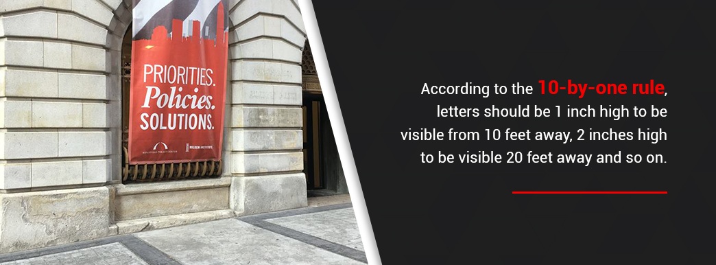
One reason to keep your message simple is that short messages are inherently easier to read. Of course, even a short message may not be legible if you don’t pick the right font or size. According to the 10-by-one rule, letters should be 1 inch high to be visible from 10 feet away, 2 inches high to be visible 20 feet away and so on.
Make sure you choose a font that is in line with your branding but is also easy to read. Stay away from “scripty” fonts that look more artful but are not instantly readable. Instead, choose fonts that are bold and clear so even a person quickly passing by or glancing over will be able to understand the sign’s message. You should also ensure the color of your text contrasts with the background of the sign.
5. KEEP VISUALS CONSISTENT WITH YOUR BRANDING
When you begin to create signs for your campaign, you should already have a clear vision for your campaign’s branding. This includes specific colors and fonts and a signature campaign logo. Your signs should be consistent with your other branded materials, such as brochures or even TV commercials. A consistent brand will help build recognition among voters. Rather than wondering if a sign is for a candidate they recently read about or saw, onlookers should have instant brand recognition when they see your logo or other aspects of your branding.
Many candidates choose to use a patriotic color scheme of red, white and blue or use either red or blue in accordance with their party. These colors are traditional choices, but you’ll find there is a multitude of shades to choose from, so you should select specific shades for your marketing materials. Or, choose different colors entirely to make your signs more unique. If you’re running for an elected school position, you might consider using signature school colors on your signage. Whatever colors and visuals you choose, consistency is the key.
6. INCLUDE RECOGNIZABLE SYMBOLS
If you want to reinforce messages like the position you’re running for or the party you belong to, you may want to incorporate symbols, or icons, onto your signs. These symbols should be easily recognizable, like the Republican Party elephant and the Democrat Party donkey.
You could also include a balance scale or gavel for someone running for a judge position, a star for someone running for sheriff or a schoolhouse for someone running for the school board. You can also include well-recognized symbols of patriotism like an eagle or stars and stripes. Be sure you think through any visuals you include in your sign design, including symbols. Only add icons that will add to your sign’s meaning and reinforce your branding.
7. FOLLOW LEGAL REQUIREMENTS
Some states have campaign finance laws that require you to include a disclaimer on campaign advertisements, stating who or what organization paid for the ad. If you need to include a disclaimer like this on your signs, make sure you incorporate that disclaimer into your design.
As much as you can while remaining legally compliant, minimize this text so that it does not take away from the main point of focus of your sign. Disclaimers like these should appear as fine print so someone glancing at your sign will merely take in the main message.