Color matching

What is Color Matching?
Here at SpeedPro, we consider color matching to be one of the most important jobs we can do for you. It’s also one of the toughest tasks: We’re here to help you take your chosen design from the screen to an accurate representation printed out in the real world and getting the colors you envisioned in the first place to look the way you want them to is key.
Before we even get an image from you to print, there are some steps you can take as part of your design process that can help you capture the most exact colors possible:
- Make sure that glare and poor lighting conditions are not affecting your ability to see what’s on your monitor.
- Get a good, high quality LED display with strong reviews and turn all color profiles off before you start designing.
- Realize that a monitor calibration is only for your own design phase and won’t match exactly when you print. SpeedPro uses an I1 device to calibrate to a PMS color build and will work with you to get the colors you want to see in your printed design. You can use the PMS color book to compare CMYK against your own designs.
- Design your project from the start using the RGB color profile. While printers use CMYK, you should work in RGB because the color gamut is broader. Printers scale that down when they print..
- Document your colors using the Pantone color library. These color swatches are standards used by designers and printers worldwide.
- Make use of soft-proofing options in design tools like Photoshop to simulate a proof prior to sending your project to a printer for a hard proof.
It is important to realize that every person perceives variations of color differently, due to both biological and environmental factors that can change over any amount of time. The colors we see when we’re young, for instance, are not exactly the same as the ones we perceive when we’re older.
Colors can also change in a game of visual “telephone” as images move from one device and monitor to another and land in front of different artists and designers along the way. The original and the final products may be off by an entire shade if too many links are in your design chain. Colors will look different based on not only the hardware but also the many various settings such as brightness and contrast.
When the time finally comes to take your project to a printer, the type of technology and materials they have available—like inks and media—add more variables to how your image might turn out. Laminates on a medium, the ink types and even something seemingly harmless like a medium’s texture will have some perceivable effects on how colors end up appearing on a finished product.
The vast array of variables at play can be almost frightening. There’s no need for that, however, as our experts at SpeedPro are here to ensure you get the proper colors translated over to your completed project.
There are two major factors that will help us in our color matching process: Color profiles and Pantones.
Color Profiles
Design and art files created digitally usually are set up with one of two primary color profiles: RGB, which stands for Red/Green/Blue, or CMYK, which stands for Cyan/Magenta/Yellow/Black. Despite this, not every single color that we can see in reality can be perfectly reproduced with either system and colors will, therefore, vary subtly as images move from monitor to printed material.
The RGB profile is based on the optical colors of light and is the color definition that is utilized by digital devices like cameras and monitors that ultimately gives us the images we see through those devices.
CMYK, on the other hand, is the color profile for pigments–the colors reflected by materials in real life. These are the four colors used in “4-color printing” that many fans of graphic design will easily recognize from the colorful pages of comic books from the 1930’s on.
Mixing RGB light creates white light while mixing CMYK pigments creates black. Because of this, a designer is able to make colors on a screen using the RGB profile that can be difficult to reproduce accurately by a CMYK printing process. Despite that, it is better to design in RGB because you can create the best possible version of your design. This is why it’s best to design from the start using the CMYK color profile. However, if you bring us an RGB file, our engineers will take your digital files through printer-specific programs to convert them into CMYK.
Pantones
Sometimes called PMS, the Pantone Matching System (PMS) consists of about 200 uniquely-identified colors. This is a standard accepted worldwide, therefore allowing printers all over to match precise colors and keep an image consistent throughout all steps of a printing process. (Learn even more about Pantones here.)
Due to the complexities of digital-to-physical color mapping, we can’t guarantee that we can hit all spot colors. However, if you can provide Pantone reference numbers that will be helpful as we proceed with color matching and hard proof creation for you to approve. This smaller version of your project will show you the actual colors on the final materials and inks.
Powerful Color-Creating Printer Technology
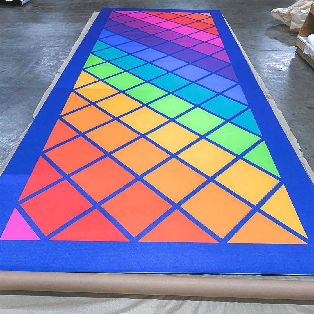
SpeedPro’s digital printers provide exceptional quality. We can print up to 1440 dpi with inks that can last up to 4 years outdoors, even without lamination. Our waterproof, solvent-based, UV-resisting inks even resist fading.
SpeedPro Boston Metrowest
Boston has an energy and excitement all its own as one of the country’s largest and most influential cities. Whether your business is located in Boston, Needham, Newton or Cambridge, you need high-impact graphics to draw attention to your services and show people your capabilities. Getting a spark of interest can lead to new relationships that become steady business.
Boston-area businesses have many signage needs we can address. We begin by having a one-on-one consultation with our new clients to gauge your needs and see how we can engage your target audience. We work closely together from project conception to delivery to achieve your vision. See what SpeedPro Boston Metrowest can do for your business.
Find Outstanding Large-Format Printing in Boston
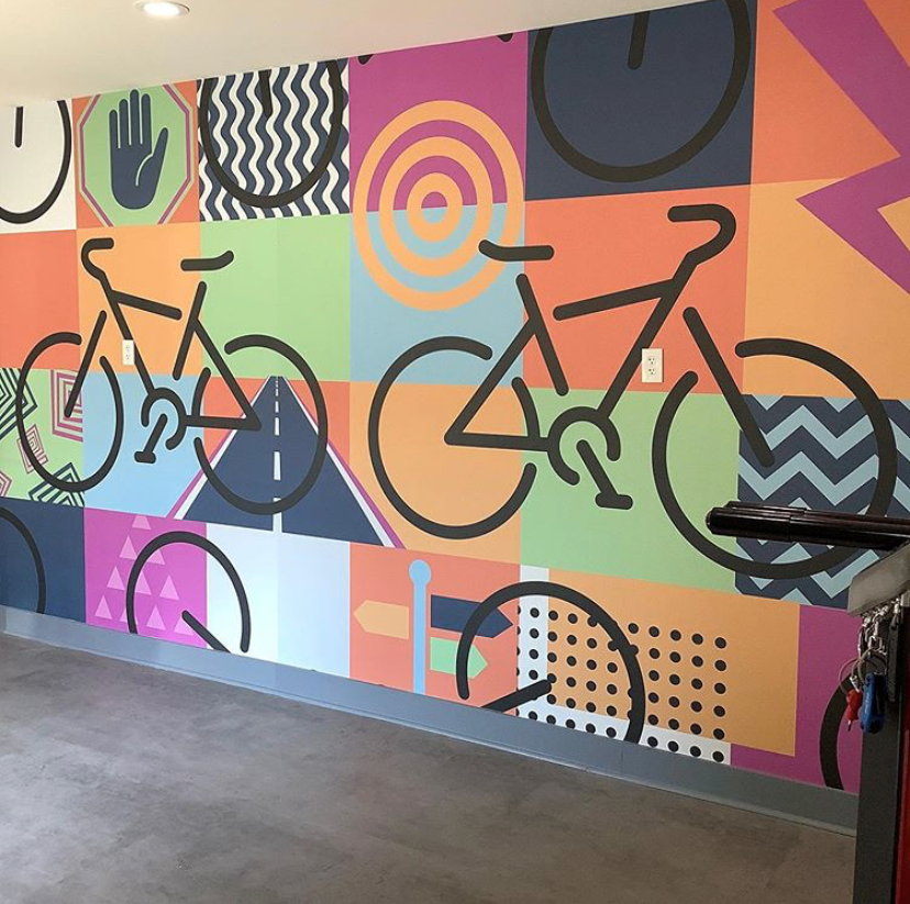
Have you ever seen an elevator wrap and immediately felt drawn into the product’s story? We provide eye-catching graphics like this that tell people more about your business and why they should choose you. When you partner with SpeedPro Boston Metrowest, you can choose from so many creative and unique approaches.
Why You Should Select SpeedPro Boston Metrowest
Our teams create longstanding relationships with people who trust us to get the job done right. Clients return to us again and again because they love the work we do. We create high-quality graphics, and you benefit from displaying them. Other advantages of partnering with us include:
- Quick turnarounds: We can finish your project fast to meet your internal deadlines.
- Green techniques: We employ quick-dry printing processes and rely on latex inks.
- Innovation: We embrace state-of-the-art technology to make your project more efficient.
- Communication: We keep in touch through every step along the project pipeline.
Get in Touch With SpeedPro Boston Metrowest
From full, partial or decal vehicle wraps that draw the eye to outdoor and indoor signage that directs people, our graphics make your business look good. Businesses in the Boston, Newton and Cambridge areas can contact us today to get a quote or request a consultation.