What Are the Sign Requirements Under ADA Accessibility Guidelines?
APRIL 26, 2019| SpeedProCategories
SignageFor many, signs in public don’t just help steer to the nearest restroom. Signs offer a blueprint to navigating safely and securely through everyday public life — in and around the very rooms, buildings and environments many of us take for granted.
ADA sign compliance is a primary way to assure equal environmental access. Business owners and building managers alike outfit their walls, doors and staircases to match ADA sign guidelines, creating spaces that are respectful and welcoming to everyone.
Yet if we’re honest, understanding ADA standards can be confusing. The sheer amount of information, combined with signage terminology and detailing, can result in even the most well intentioned people hindering an inclusive environment.
SpeedPro studios have been printing ADA-compliant building signage for decades. We’ve made it a point to know the ins-and-outs of ADA sign design, so business owners, facility managers and more have one less item on their minds and one more boost to their businesses — an environment that’s appealing — and open — for all.
What are the requirements of the ADA? How do they affect your building’s signs and spaces? We’re breaking it all down below.
What Are ADA Accessibility Guidelines (ADAAG)?
The Americans with Disabilities Act (ADA) assures anyone with a disability has access to the same spaces and opportunities as those without disabilities. It oversees civil rights protections for employment, schooling, transportation, public facility and commercial building accommodations, all with the thought that physical conditions should not become permanent, quality-of-life inhibitors.
The ADA’s sign regulations are a practical extension of its civil rights protections. In short, the ADA sets design standards for signs that identify a room, space or area as well as signs that relay relevant information about public settings. Any architectural or building sign that designates a permanent building feature or describes an accessibility-minded alternative feature falls under ADA compliance guidelines.
There are a few exceptions, or tolerances, to the ADAAG. However, the vast majority of commercial and public-facing operations must adhere to its tenets, including:
- Retail stores
- Commercial businesses, both civic and mercantile
- Restaurants, cafes and cafeterias
- Medical facilities
- Libraries
- Public parks
- Public transportation facilities
- Lodging
- Civic services, legislative, judicial and government regulatory buildings
- Detention or correctional facilities
In short, virtually all major building and industry types must follow ADA sign standards. These sign requirements are for businesses with certain customers and clients as well as for non-commercial public spaces like parks.
Understanding ADA Standards
ADA accessibility guidelines state compliant signs must be stationed in all permanent, public and private-access building areas.
This means signs mounted in employee-only areas as well as consumer-facing ones. General ADA guidelines also describe conditions for interior and exterior signs, as well as rooms unlikely to change function in the near future.
In short, if you’re identifying a particular room or area in a building, that room or area legally requires a sign. And if that room or area experiences visitors of any kind, then its signage needs to be ADA compliant.
1. ADA Sign Types
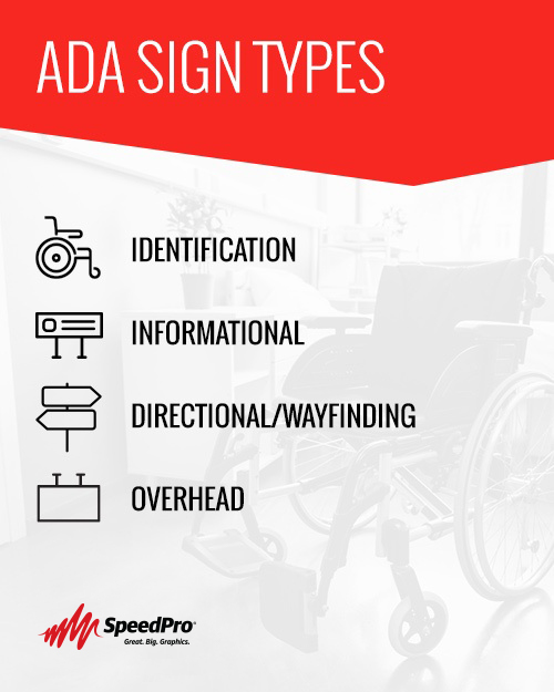
There are four main signage classifications according to the ADA:
- Identification: Signs that denote a specific room, area or zone. Identification signs comprise the majority of public signs and are what people most often imagine when considering the ADA’s regulations. Examples: “Restroom,” “Wheelchair Ramps,” “IT Department.”
- Informational: Signs that provide context for a specific room or area. Informational signs further the public’s understanding of what to expect from a room or zone but won’t necessarily denote the room type itself. Examples: “Employees Only,” “Authorized Personnel Only.”
- Directional/Wayfinding: Signs that manage traffic flows and help guests navigate to and within a building. Wayfinding signage often includes pictures or icons like arrows to support its direction-giving. Examples: “Waiting Room This Way,” “Emergency Exit.”
- Overhead: Signs projecting from walls but mounted overhead or those hanging directly from the ceiling. Examples: Traditional exit signs, elevator signs.
It’s essential to understand the selection process between each sign category, as well as how and why each is used. Visual communications studios like SpeedPro can assist in navigating categories, ensuring your sign selections are appropriate for usage, placement and industry.
2. ADA-Mandated Sign Locations
In addition to the four main sign types, there are roughly a dozen major ADA-outlined signage locations. Placing the proper permanent signs in these areas is the foundational step toward full ADA compliance.
Federal and state regulations maintain that signs must be outfitted wherever there are the following:
- Restrooms
- Exit and entryways, both regular and emergency
- Stairwells and ramps
- Loading docks/zones
- Elevators and lifts
- Parking and passenger loading areas
- Alarms
- Specialty instruments, controls and operational machinery
- Telephones
- Automated Teller Machines (ATMs)
- Seating areas
- Dressing and fitting rooms
General ADA Sign Compliance Requirements for Businesses
Understanding ADA standards can be technical and time-consuming. However, doing your signage due diligence as a business owner allows you to breathe easier, knowing you’re creating an environment you can be proud of and your customers will respect across your store, restaurant, office and more.
The following design elements comprise the overall guidelines and statutes of the ADA’s sign requirements.
1. Size
Suitably sized signs are an intuitive place to begin when crafting ADA-compliant materials. When it comes to ADA standards, the guiding size principle is that bigger isn’t always better.
Compliant signs should bear in mind two guiding properties — mounting height and the average viewing distance.
- Mounting height should be no lower than 40 inches from the ground yet no higher than 120 inches.
- Viewing distance should be calculated in feet, using the layout of the room, average traffic flows and logical reading distances to surmise where individuals will best see the sign.
Character, Spaces, Lines and Margin Size
Signs are made up of characters, spaces, lines and margins. Sizing requirements for each go as follows:
- Characters: Characters are individual letters, numerals or symbols. Character sizing is determined by the category of the sign, as well as its mounting height and viewing distance. Identification signs, for example, should have text a minimum 5/8 an inch and a maximum of 2 inches tall per character. Informational and directional signs begin at 5/8 an inch and have no maximum height. Likewise, overhead signs’ characters start at 2 inches and go up from there.
- Spaces: Space here refers to the space between each character, not between words. The width between sign characters should never be smaller than 1/8 inch.
- Lines: One line consists of all the characters and spaces on a single row. The spacing between lines of text should sit between 35 to 70 percent of letter character height. If two different-size characters are used on two consecutive lines, complaint line spacing correlates with the larger of the two heights.
- Margins: Margins are the distance between a sign’s visual elements and its edges. All sign margins should be a minimum of 3/8 of an inch wide around all raised elements, including Braille.
Overall Sizing Chart
Once you have measured the sign’s mounting height and average viewing distance, you can calculate your sign’s compliant dimensions. The ADA recommends the following as the basis for its sizing chart:
- Sign length: The horizontal dimension of a compliant sign is determined by the number of characters and spaces placed on each line, along with these characters’ sizes. For example, a sign with a maximum of 20 characters per line and a character height of 7/8 of an inch will, according to the ADA’s sign design calculations, need to be at least 16 inches long.
- Sign height: The height of a compliant sign is based on the maximum number of lines permitted by the character’s height. For example, a two-lined sign with characters 1.25-inches tall will need to be at least 6 inches tall.
2. Text
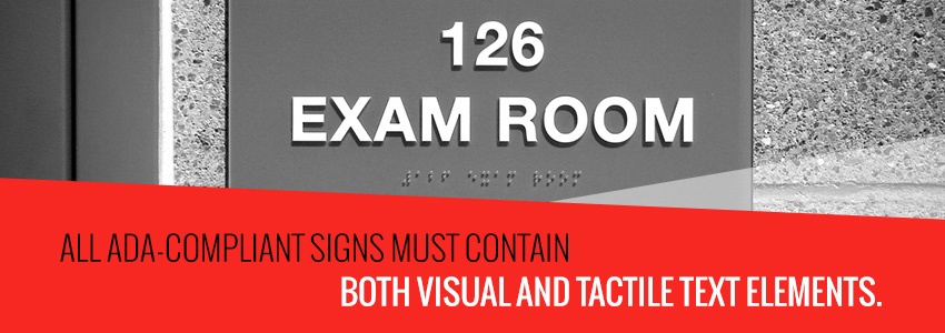
All ADA-compliant signs must contain both visual and tactile text elements. For the vast majority of public signs, that means messages printed in both raised-letter standard English and, directly beneath, repeated in Braille.
Fonts used for the raised letters must be ADA-approved. This means Sans Serif or Simple Serif fonts only, without any decorative scripts, ornaments or letter extensions at the edges of a character’s form. Text should not be overly bold, italicized, condensed, oblique or otherwise embellished.
Other essential elements to ADA-compliant sign text include:
- Character stroke, or the thickness of individual letter lines. Character stroke widths will differ. Identification signs should have character strokes no greater than 15 percent of the entire character’s height, while informational, directional and overhead can have a 10 to 30 percent character stroke range and remain ADA compliant.
- Character case, with all characters uppercase unless signage is not an identification sign.
- Character depth, with characters raised 1/32 of an inch, or 0.8 millimeters, above their sign background.
- Character proportions, with two letters comprising proper font proportion calculation — “O” and “I.” Across sign types, the ADA states the width of a font’s uppercase “O” must be at least 55 percent and up to 110 percent of the height of its uppercase “I.”
The size of characters should fall between 5/8 of an inch minimum and 2 inches maximum, depending on which of the four sign types is used. The space between individual raised characters should not fall below 1/8 inch or exceed four times the character stroke. For the other three signs — information, directional, and overhead — character spacing should fall between 10 to 35 percent of character stroke.
In review, regulatory statutes state compliant sign text will generally break down as follows:
- Identification signs: Characters must be between 5/8 of an inch and 2 inches with a minimum of 1/8 inch spacing between, in all uppercase, Sans Serif font
- Information or directional signs: Characters can be 5/8 of an inch minimum with no maximum with individual spacing 10 to 35 percent of stroke, in uppercase or lowercase, Sans Serif font
- Overhead signs: Characters begin at a 2-inch minimum, in upper or lowercase lettering, with 10 to 35 percent of stroke comprising complaint spacing between characters, in Sans Serif font
3. Placement
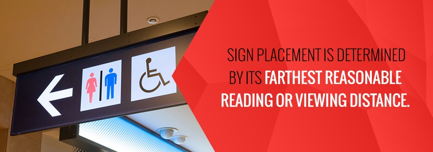
Sign placement is determined by its farthest reasonable reading or viewing distance. In addition, a sign’s minimal character dimensions will also affect its compliant placement and reading vantage. The ADA regulates signs into three general placement categories:
- Signs mounted 40 to 70 inches off the ground: Signs vertically mounted between 40 and 70 inches should have character sizes no smaller than 5/8 to 3/4 of an inch and a reading vantage of 6 to 7 feet. The farthest reasonable reading distance for signs mounted at this height is 27 feet, with character size 3.25 inches.
- Signs mounted 70 to 120 inches off the ground: Signs vertically mounted between 70 and 120 inches should have character sizes no smaller than 2 inches and a minimum reading vantage of under 15 feet. Character size should not exceed 5.25 inches at reading distances of 36 to 37 feet.
- Signs mounted over 120 inches (ten feet max): Signs vertically mounted at or over 120 inches should have 3-inch characters minimum when reading at distances under 21 feet and up to 6-inch characters when reading at distances over 40 feet. The ADA does not classify accessibility signs in the same manner when they exceed a 50-foot vantage radius.
Compliant sign placement carries a few other important details:
- Centering signs: Signs should be installed in a manner that “centers tactile characters,” meaning text remains unobstructed by walls, swinging doors or any other visual inhibitors. Centered signs must have a minimum of 18 by 18 inches of cleared floor space directly beneath. Wall-mounted signs should be a minimum of nine inches away from the nearest latch door.
- Door accommodations: Wall-mounted signs placed near doors must be installed on the latch side of that door, 48 to 60 inches off the ground. If double doors are present, signs should be installed on the right side of the right-hand door.
- Ceiling accommodations: Overhead signs must have a minimum of 80 inches between the bottom of the sign and the floor.
- Tactile positioning: Tactile characters and Braille lettering must be reachable regardless of sign type, excluding overhead signs. Braille text can be mounted with no less than 48 inches (4 feet) between the floor and its lowest line of characters, while the maximum mounting height is 60 inches (5 feet) from the ground to lowest character baseline.
4. Colors
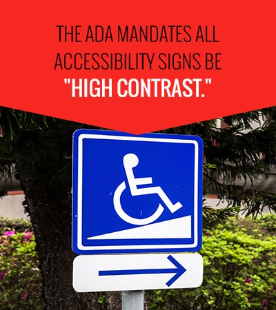
There are no limitations on what colors can be used for ADA-compliant signs. Instead, the ADA mandates all accessibility signs be “high contrast.”
High-contrast signs are those with distinct differentiation between the sign background color and sign text.
- As a general design benchmark, signs should have a 70 percent brightness differential between backgrounds and text. This ensures proper color contrasting and promotes overall sign visibility.
- Light characters should accompany dark backgrounds, or a light background accompanying dark characters, all to maintain intuitive, mandated contrast.
There are several “standard” sign colors endorsed and most used according to the ADA. These colors correspond with the Pantone Matching System (PMS) — used by printers and graphic designers to match new materials with existing color schemes — and include:
- Yellow PMS 109C
- Blue PMS 301C
- Ash PMS Warm Gray 1C
- Silver Gray PMS Cool Gray 7C
- Charcoal Gray PMS 425C
- Graphite PMS NA
- Black PMS 6C
- White PMS Transparent White
5. Pictures and Images
Many accessibility signs contain icons along with text — if not simply lone icons. Known as pictograms, these visuals clarify a sign’s message and make it even easier for audiences to ascertain its meaning without language or literacy barriers.
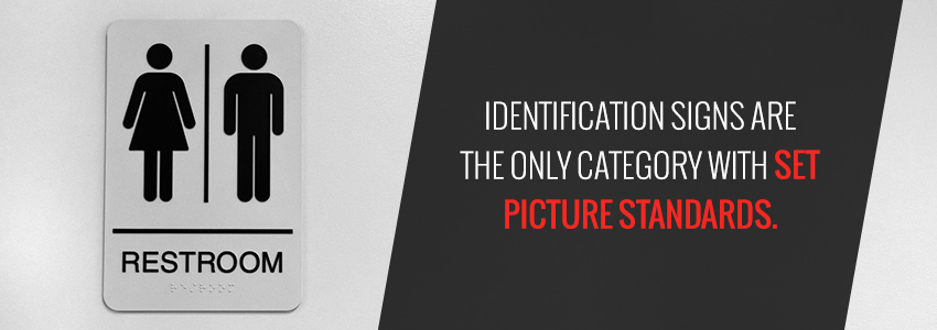
Of the four ADA sign categories, identification signs are the only category with set picture standards. An identification sign’s pictograms must contain:
- 6-inch field height: Pictograms must maintain at least 6 inches of field height, meaning there should be at least 6 inches of unobstructed space on the sign dedicated to displaying the picture. There are no specific regulations on the height or size of the pictogram itself.
- Top placement: Pictograms should be printed above all lines of visual and tactile characters.
- ISA symbols: International symbols of access (ISA) are icons meant to be globally recognizable, regardless of a viewer’s native language, literacy level or geographic location. The ADA recommends using ISA symbols as pictograms whenever possible.
6. Finishes
ADA sign guidelines maintain all accessibility signage should contain a non-glare finish. Identification, informational, directional and overhead signs alike must be matte, shine-eliminating or sheen-free laminates and finishes.
7. Braille and Raised Characters
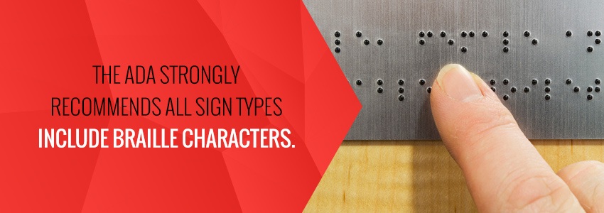
Identification signs are the only signage category where the ADA mandates the inclusion of Braille letters and raised-letter text. However, the ADA strongly recommends all sign types — identification, informational, directional and sometimes even overhead — include Braille characters.
Compliant Braille lettering adheres to the following regulations:
- Braille dots and cells: The individual dots comprising a Braille cell, or its character, must be dome-shaped, not pointed or plateaued, with a 0.06-inch base diameter and 1/4 of an inch height.
- Braille grade: Signs should use contracted Grade II Braille, with the majority of characters following sentence-case capitalization rules.
- Braille spacing: Individual Braille dots should have 0.1-inch margins on all sides. Braille cells should sit 0.3 inches apart from one another. Lines of Braille should have 0.4 inches between them, with 3/8 of an inch between lines of Braille and all other raised text or elements.
- Braille positioning: Braille lines should be placed directly beneath their corresponding raised text.
Exceptions to the ADA Accessibility Guidelines
While the vast majority of building and room signs require ADA compliance, there are a few exceptions where signs remain unregulated:
- Building addresses
- Building or structure directories
- Parking signs
- Temporary signs
Temporary signs have been known to cause some confusion. The ADA defines temporary signs as those only meant for use for seven days or less.
How to Create an ADA Compliant Sign
The easiest way to guarantee signs in your office or building are ADA compliant is to work with full-service, professional signage printing partner.
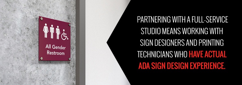
Partnering with a full-service studio means working with sign designers and printing technicians who have actual ADA sign design experience. Past projects have familiarized these experts with the ins-and-outs of complete ADA accessibility requirements. Plus, these studios have the tools and technology needed to ensure complete font, pictogram, color, finish, raised lettering and Braille scale compliance.
Some studios, including SpeedPro, will even employ a surveying team to visit and assess your space firsthand. They’ll help determine your signage needs, placement requirements and take accurate wall measurements — all so you can rest assured that you’re getting the right regulatory signs.
Looking to take a more hands-on approach to your ADA signs? Follow these SpeedPro-approved process steps to assure full design and installation compliance:
- Select your sign type. Know if your space calls for identification, informational, directional or overhead signage. Your sign type directly affects what design rules and regulations will need to be followed.
- Determine sign mounting height and reading distance. Consider your sign’s reasonable reading distances and associated mounting heights given the room or area where it’ll be placed.
- Calculate compliant character height. ADA-compliant character height is based off a sign’s category and mounted placement. Remember, most characters must fall between 5/8 and 2 inches in height, with spacing between never lower than 1/8 of an inch.
- Calculate character stroke. Identification signs should have character strokes no greater than 15 percent of its character’s height, while informational, directional and overhead signs can hold a 10 to 30 percent character stroke range and remain ADA compliant. Use the heights calculated earlier to determine proper character line widths.
- Calculate character spacing. The room between individual characters should be 10 to 35 percent of character stroke.
- Calculate line spacing. The spacing between lines of text should sit between 35 to 70 percent of letter character height.
- Account for margins. Include 3/8-inch margins surrounding all lines, both raised written text and Braille.
- Calculate sign width and size. Compile all the character, line and spacing measurements to create the blueprint for your new sign.
- Select and position pictograms and colors, if necessary. Remember to include a high-contrast, dual color scheme, ISA pictograms and a non-gloss finish for the easiest sign comprehension.
- Prep the placement. Ensure the area where you’ll be installing your ADA signs is clear and unobstructed, with adequate lighting and free from visual impairments. Double check sign reach ranges and spatial allowances of nearby doors or windows. Rearrange or remove potentially sign-inhibitory objects, then check that the ground or floor directly around the new sign is smooth and level.
In Need of ADA-Compliant Signs? Consult Your Local SpeedPro
The technicalities and level of detail involved in the ADA’s accessibility guidelines can be intimidating. Let our nation-wide network of visual-communications studios take care of ADA design requirements and signage printing for you, in one shop, with one team.
- We perform on-site analysis and measurements.
- We select the compliant sign type and level of detail
- We create the sign mock-ups and drafts.
- We double check today’s latest government standards.
- We print the fully compliant signs, then provide transparent, regulations-aligned installation instructions.
Contact your nearest SpeedPro studio to get started.


