Great. Big. Graphics.
DECEMBER 10, 2014| SpeedPro of SF PeninsulaCategories
UncategorizedWe’ve got a new tag line and revised logo
We’ve got some re-branding of our own going on! Like many of our clients, we’re in the marketing business and that includes marketing ourselves. So, over the next few months, we’ll be rolling out a few changes to our look — but not our “feel”.
SpeedPro has refined its position in the large-format graphics industry, and our new identity is matched by a simplified, adaptive design. It’s the SpeedPro you’ve come to know, streamlined.
We’re now officially Pro with a capital “P.” The choice isn’t just cosmetic. Our brand identity begins with our name, and what better way to emphasize what we do than to break it down to its parts? The “P” in Pro officially stands for “Professional,” but it could stand for our promise–that your branding is safe with us.
These colors don’t run, but they do talk.
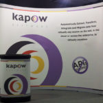
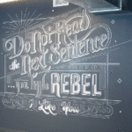
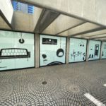
In the next few months, we’ll be demonstrating our official product colors–one for each major area we work in. From vehicle wraps to event graphics to wall murals to trade show displays, we’ll make it easy for you to find what you need on our site and literature.
Let’s keep it simple. We may look, spell, and sound a little different than we used to, but we’re still the same team. Whatever our presentation, SpeedPro of SF Peninsula remains dedicated to being the large-format provider of choice for the greater Bay Area — San Mateo, Palo Alto, Fremont, Hayward, or downtown San Francisco, we serve you all with our new logo as before with the traditional version of our look. Feel free to reach out to us at info(at)speedprosfbay.com or click here to submit a request and we’ll get right back to you.

