Raised Lettering
Create bold, tactile, and eye-catching signage with precision-crafted raised lettering.
What is Raised Lettering?
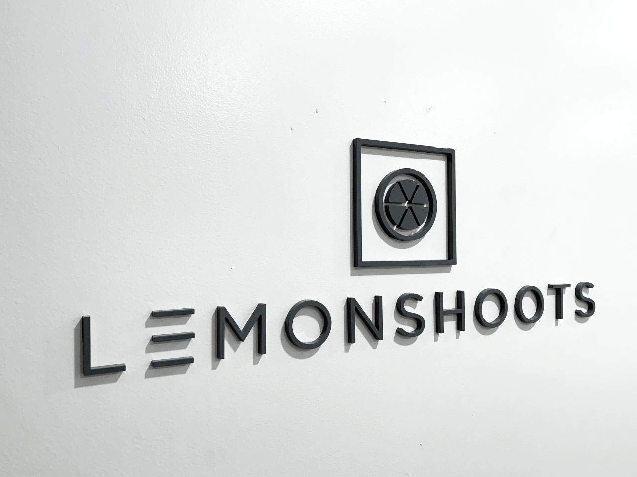
Raised lettering consists of letters, logos, or graphics physically elevated above the background surface—a three-dimensional (3D) effect that enhances visibility and impact. Ideal for interior and exterior signage, lobby signs, awards, and ADA-compliant applications.
Key Benefits
- Enhanced Visibility: Stands out from flat signage and readable from greater distances.
- Brand Elevation: Adds emphasis and perceived value to your identity.
- Durable & Professional: Crafted from robust materials like metal or acrylic for long-lasting use.
- Accessibility & Compliance: Crucial for ADA and tactile signage. Raised text paired with Braille assists visually impaired users.
Applications
- Exterior & Storefront Signs: Boost curb appeal and visibility in busy environments.
- Interior & Wayfinding: Elegant lobby signs, directional markers, and restaurant menus.
- Custom Logos, Awards & Plaques: Ideal for upscale finishes and tactile experiences.
- ADA-Compliant Signs: Raised text and Braille meet federal guidelines.
Styles & Materials
Plastic Raised Letters:
- Formed plastic: rounded, smooth aesthetics
- Injection molded: flat, thick letters
- Flat-cut plastic: sleek, low-profile options
Metal Raised Letters:
- Cast: aluminum, bronze
- Flat-cut: brass, stainless steel, Cor‑Ten
- Painted finishes: vibrant, weather‑resistant
- Optional lighting accents: halo, back‑lit variations
ADA & Tactile Guidelines
To ensure compliance with ADA/ADAAG/TAS standards:
- Letter height: 5/8″–2″; spacing adjusted for viewing distance.
- Raised depth: ≥1/32″ (≈0.8 mm) above background.
- Font style: Uppercase sans serif (e.g., Helvetica, Futura, Trebuchet).
- Spacing & stroke: Character stroke ≤15% of height; inter-character ≥1/8″; word spacing ≥10 mm; clearances from borders ≥3/8″.
- Color contrast & finish: High contrast (70%+) with non‑glare, matte finishes.
- Braille placement: Contracted Grade 2 Braille directly below text, min. 3/8″ from tactile features.
Design & Installation Tips
- Keep it simple: Limit text and visuals—“less is more”.
- Optimal dimensions: Letter width ≈1/5 of height; font size based on reading distance.
- Lighting: Halo or channel-lit letters perform best; avoid overbrightness.
- Regular maintenance: Clean every few months with mild soap to preserve finish; avoid harsh cleaners.
- Placement & mounting: ADA mounting 48″–60″ above finished floor; letters should be flush with background transitions.
Letter Sizing Guide
| Viewing Distance | Minimum Letter Height |
|---|---|
| 100 ft | 4″ |
| 250 ft | 10″ |
| 500 ft | 22″ |
| 1,000 ft | 43″ |
Use this to ensure optimal readability speedpro.com
FAQs
How large should my letters be?
Use the table above to match letter height with intended viewing distance.
How to maintain raised lettering?
Clean every few months using warm water, gentle soap, and a soft cloth—never use harsh chemicals.
Raised Lettering Install
Showcase Gallery


Get Started with SpeedPro
Our team can help you:
- Choose ideal materials (metal vs. plastic)
- Design with ADA compliance
- Apply lighting and finishes
- Handle installation and maintenance planning
Ready to elevate your brand? Contact us today to discuss your raised lettering project!