
ADA Signage Design Requirements
APRIL 12, 2024| cericson2024 brought SpeedPro East Bay an upgraded flatbed printer, the Cannon Arizona, a “true” flatbed printer using UV ink and varnish. This printer also prints White and offers our clients the ability to print directly to rigid media with a matte and gloss finish on the same piece.
The Arizona also allows us to print braille and tactile lettering, meeting the Americans with Disabilities Act (ADA) standards for signage. This means that projects that we previously outsourced can now be done in-house. But, that also means that we had to learn how to design ADA, and that’s what this Signs of Life is about.
The ADA
The Americans with Disabilities Act of 1990 is a civil rights law that prohibits discrimination based on disabilities. It includes details of Signage that make it easier for people with disabilities to access and use.
The 2010 ADA Standards for Accessible Design for signage are very specific and comprised of a 279-page document with an additional 255 pages of explanations and guidance from the US Access Board. I’ve broken these down here.
Braille.
Not all ADA signs require Braille. According to ADA Standards, Braille is only required on signs that identify a room, space, or area—whether it’s accessible by the public or if it’s just for employees.
Braille is required for signs outside of restrooms, meeting and conference rooms, utility rooms, classrooms, and common rooms.
Braille is NOT required for directional signs, elevator signs, check-in signs, informational signs, open hours, security signs, staff-only signs, exit signs, refuge signs, stair signs, and floor number signs.
If the sign requires Braille, it also requires raised text.
Raised text (Tactile Lettering) has its purpose, as less than 10% of the 1.3 million people who are legally blind in the US know how to read Braille. A sign with Braille makes it a tactile sign to serve the visually impaired—which means the text needs to be raised as well.
Grade 2 Braille.
There are three levels of complexity in English Braille. ADA standards require Grade 2 Braille, which was introduced as a space-saving alternative to Grade 1 Braille. Grade 2 Braille abandons one-to-one transcription and adds hundreds of abbreviations and contractions, making it easier to fit on signage.
Keep Braille transcriptions together.
To make things easier for the visually impaired, it’s required that all Braille is grouped in one section, and always located at the bottom of the sign.
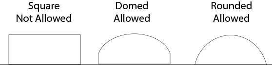
Dimensional requirements of Braille.
ADA standards specify dimensional requirements to ensure that the Braille is easy and comfortable to read (no sharp edges).
Braille Dot Size
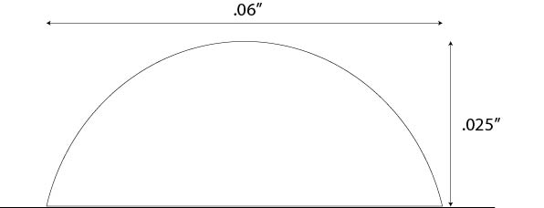
Braille Dot Profile
Adding Braille to your design.
You’ll need to install a Braille font in a design program like Adobe Illustrator. Most Braille fonts don’t work with Grade 2 Braille. Ours does, it’s called Swell Braille. It is available to download here: https://www.ffonts.net/Swell-Braille.font.download
Once installed, set the font height at 30 points and the leading at 30 points. This will give the braille the right height and distance between lines.
You’ll then translate your text into Grade 2 Braille. You can use the free Braille Translator at:
https://www.brailletranslator.org
Type or paste your text, in lowercase, into the text box, and select language English (U.S.) 2. Hit the “Start” button. Your text will be translated into Grade 2 Braille. You’ll be able to select it, copy it, and paste it into your document. Double-check that the text size and leading are both 30 points.
Then OUTLINE the Braille text just like you’d outline any font-based text.
Position your text correctly. Braille must all be grouped together and at the bottom of the sign. There needs to be a minimum of 1” high space for each line of Braille to fit into, and the top of the Braille must be ½” below the bottom of any other text, pictogram, or raised or tactile lettering.
Images on ADA signs.
You can call them icons, emojis, or symbols, but the term that’s used in the signage world is pictogram. A pictogram is a quickly comprehensible image that helps someone navigate a space. A pictogram must be in its own 6” high space on the sign, and be sized to fit into that space.
When it comes to ADA signage, there are 3 pictogram categories to know.
- Required pictograms: There are only four pictograms in this category, and they are those that serve the disabled.
- Recommended pictograms: Pictograms are recommended for signs that identify a room.
- Optional pictograms: These common pictograms are not part of ADA standards, but they may be required according to your industry, building, or state in which you operate.
Pictograms are required on signs that assist the disabled.
Any sign that provides directions to accessible spaces requires pictograms. In most cases, that means that signs for wheelchair-accessible restrooms and parking spaces should have the pictogram below.
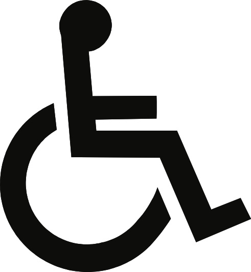
The international Symbol of Accessibility for anything that is wheelchair accessible. Including restrooms, parking spaces, vehicles, buttons, stations, and routes.

The international symbol of TTY, a public teletypewriter or text telephone, which allows the hearing impaired to type messages back and forth instead of talking.

The volume control telephone symbol. An amplified telephone, which allows the hearing impaired to have clearer telephone conversations.
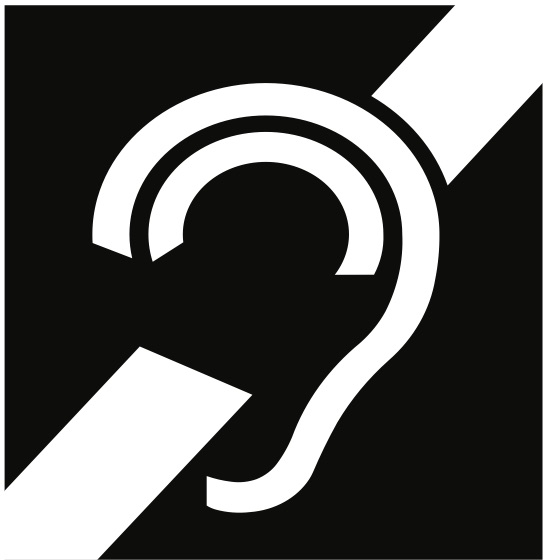
The assistive listening systems symbol. An assistive listening system is a device that allows the hearing impaired to amplify sounds directly into the ear.
Pictograms are recommended on room signs (and in California, required on restrooms)
ADA standards recommend pictograms on any sign that identifies a permanent room, as it’s always helpful to be able to quickly identify your conference room or break room. This is especially helpful if many of those using the space are non-English speakers.
You can get creative with the design but remember that any clever illustrations should still be clear enough to guide the way.
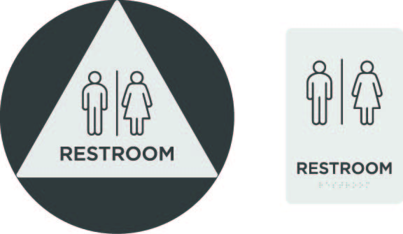
California ADA Restroom Signs
Unlike other states, California requires two signs for restrooms. CA Title 24 requires one sign on the wall next to the door handle and one more sign on the center of the door. The sign in the center of the door must be 12” in diameter, the sign by the door, 6” wide by 9” high.
Pictograms are optional on all other signs.
Fonts for ADA Signage
Font Requirements
Set your text in uppercase, and choose a font that is in an easy-to-read sans serif. Do not use script, decorative text, or any unusual font.
Common fonts used for ADA-compliant signage are Helvetica, Futura, Frutiger, Din, Avenir, or Univers.
Text Spacing
Appropriate spacing around (and within) the text can greatly help with legibility. Keep in mind that the visually impaired will need to feel around the sign for where the text starts. Leave at least ⅜” around the text, between 35-70% of the character height between lines. Between the last line of text and Braille there must be ⅜” to ½” and below the Braille to the bottom of the sign should be at least ⅜”.
Installation of ADA Signage
Placement of ADA wall signs
Your wall sign must be displayed on the knob side of the door in a space that is at least 18″ wide (in the case of double doors, it should be on the right). If you have less than 18″ of space for the sign, it should be on the adjacent wall—not on the other side of the door. The bottom of the Braille must be between 48” and 60” above the floor.
Overhead Sign Display
Regardless of how your sign is mounted, any sign that is displayed overhead must be at least 80″ from the floor.