How to Improve Your Graphics
JULY 3, 2018| SpeedPro East BayCategories
SignsDo you ever struggle with coming up with a graphic design idea? Or do you have a design, but just don’t feel like it conveys your message? Here at SpeedPro East Bay, we want to help you avoid this issue completely so you can focus on your business! Here are three tips for you to consider as you make your next design.
Idea
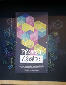
Can’t come up with an idea for your design? Look for inspiration elsewhere! The internet is an amazing resource and is chock-full of aesthetically pleasing, simple designs. For best results, go on our website, speedproeastbay.com. We have plenty of pictures from previous projects and can inspire and help with your graphic design needs!
Color
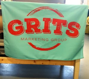
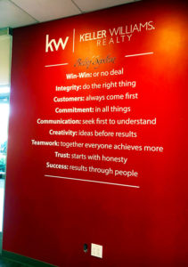
Use color to your advantage. The specific color palette you use should conform to the message you’re trying to convey. With a bold, eye-grabbing design, try using bright colors such as red and yellow. With a more subtle design, use muted colors such as olive green or a relaxing sunset orange. Remember, your colors will be the first thing a customer sees!
Contrast
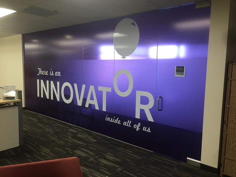
If some parts of your message are more important than others, contrast is a great tool to use to make sure a specific part of your message stands out. By using a different color than the background or by utilizing a different/larger font, contrast can be achieved easily and efficiently.
Don’t hesitate to use SpeedPro East Bay for your graphic design needs.


